
Wondering what to wear for fall family photos? This guide breaks down the best outfit colors for peak autumn foliage—warm oranges, browns, mustard, sage, navy—plus what to avoid.
Get out your color wheel, friends, because we’re jumping on the merry-go-round of color theory!
(Don’t worry. There’s no quiz later!)
What shades are in the environment during peak fall colors?
The best fall outfit colors are all about complementing the environment.
I’m in Iowa, and PEAK fall colors, when most trees are a golden yellow, reddish-yellow, or orange hue, happen the first 3 weeks of October.
There’s still some green grass at that point too, but it’s darker green, not spring green.
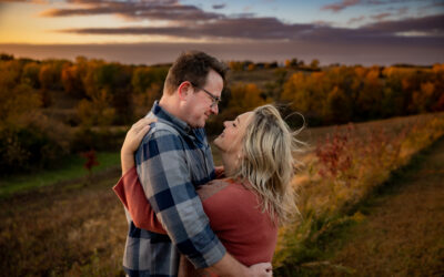
The most obvious outfit colors will be inside the same color palette that’s all around you.
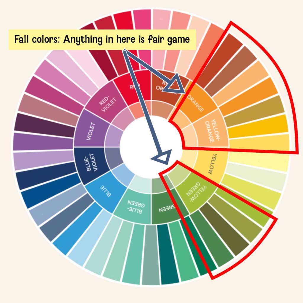
An easy place to start your search for colors: by thinking about what’s around you.
And you guessed it: these “environment colors” are GREAT choices for your fall outfits.
But there’s always nuance, especially in color theory. You can’t just pick “any ol’ yellow.” Here’s what to look for!
Fall outfit colors: The Main Autumn Shades
Oranges should be muted, not bright.
Pumpkin orange is really pretty in the fall. But the shade of orange really matters.
Think muted/desaturated, not bright or neon.

The best orange shade is on Mom in the photo below. It’s pumpkinny, but more like canned pumpkin than the actual rind of a pumpkin.

Brown in any shade works great for fall pics.
You can get away with pretty much every shade of brown! I’m partial to a good chocolate brown, like the dress at right in the photo above.
Fun fact: Brown actually is a dark shade of orange on the color wheel. It can trend warm or cool, and both types work well during peak fall color.
Yellows should be more orange than green.
I love a punch of mustard yellow, like the T-shirt in the photo below. The key for yellows is choosing shades that lean ORANGE rather than GREEN.

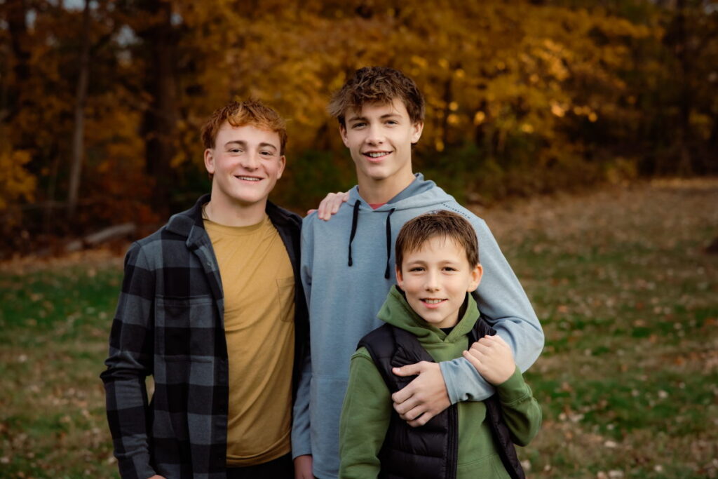
While we’re at it, though, let’s talk about the other colors in this photo of the three boys.
The sage green hoodie on the littlest one is a great green choice. It’s a warm green, which is why it works so well. I talk more about greens in the next section!
In the trio above, the blue/gray hoodie is more cool than warm, which is why it pops out from the other two.
Navy blue or rust would have worked here, as well as a neutral like gray (the dark gray in the plaid shirt is one idea).
That said, the hoodie color is just gray enough that it isn’t super distracting.
Fall outfit colors: Adjacent Shades
Choosing colors that fall right next door to the environment on the color wheel is another safe choice.
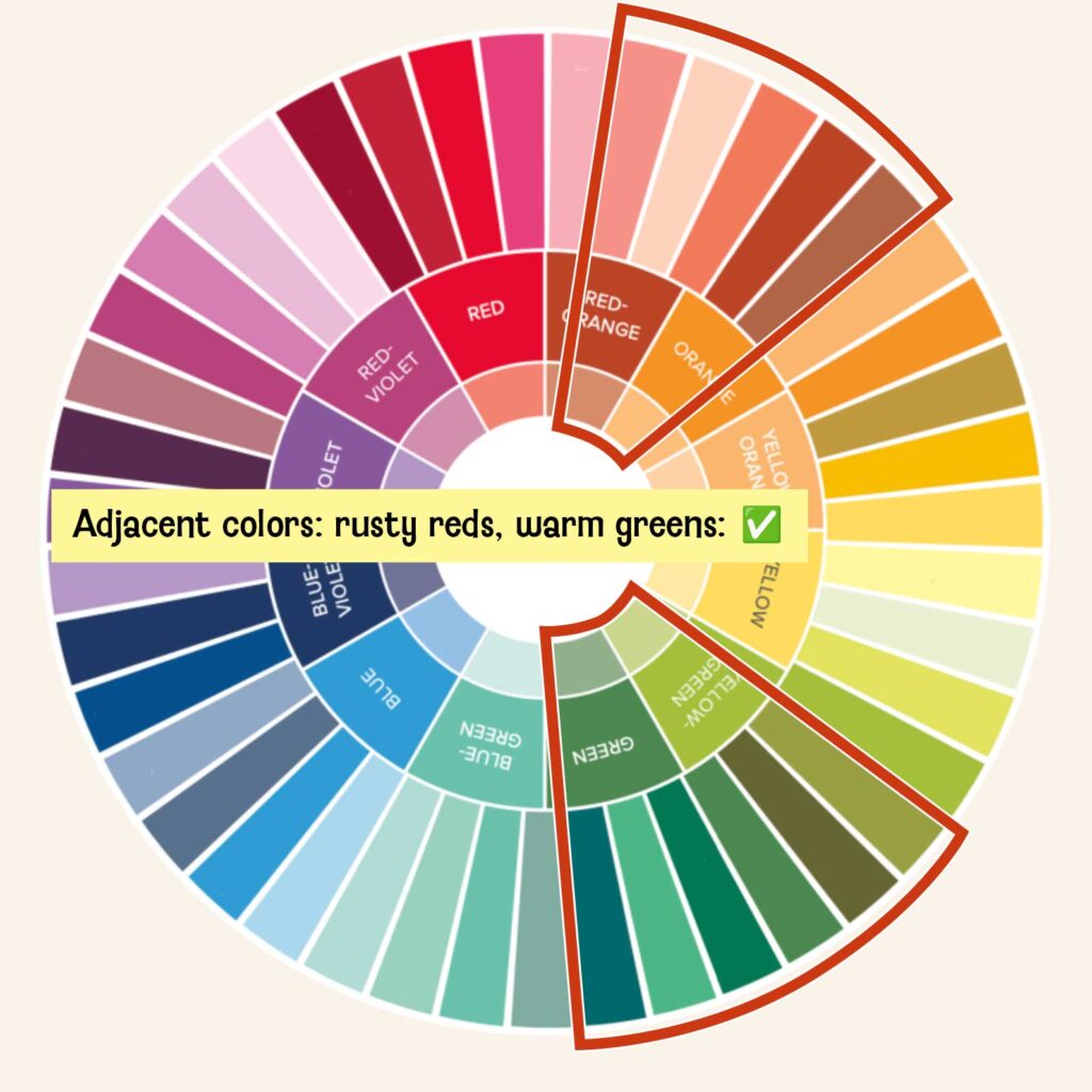
Rusty reds and browns are a hit for fall photos.
The operative word is rust—that makes it a reddish hue that’s closer to orange than pink.

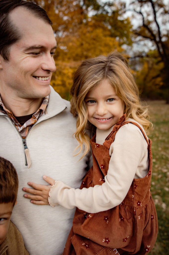
The little girl in this photo is wearing a perfect shade of rust.
Warm greens work better than cool greens.
How can you tell the difference between a warm and cool green? By gauging how much yellow or blue is in it. Let’s take a closer look.
First, let’s see some cool and warm greens side by side.
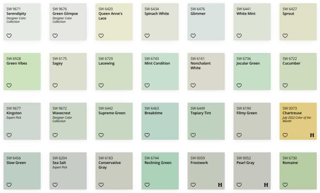
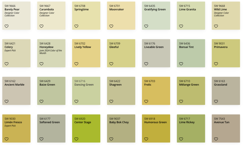
Do you see how the second set (warm) is more yellow overall, while the first set is more blue? That’s your warm/yellow vs cool/blue.
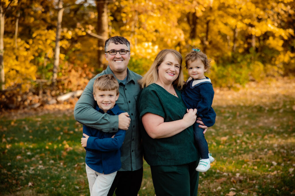
Can you tell if the greens in the photo below are warm or cool?
Answer: Both are cool greens. Mom’s green is a bit warmer than Dad, and has more yellow in it, but it’s still just over the line toward blue.
More Fall Outfit Colors: Navy, Dusty Blue, and Deep Red
There are a few standalone colors you can incorporate in your fall outfits that aren’t immediately obvious from the color wheel.
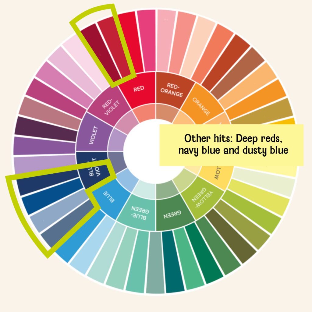
Blues are difficult in the fall. They should be dark or desaturated.
The set of blues that work well during fall color is very narrow. Because there’s so much YELLOW in the environment, and blue is directly across from yellow on the color wheel.
Opt for darker shades of blue, like navy blue, or desaturated blues, like dusty blue.
That’s why I recommend dark denim over light, since it’s closer to a navy blue.
We’re trying to get blue to act like a neutral here. Too much saturation (or intensity) in a blue will be distracting (there’s an example later on that demonstrates this).
Navy blue is really lovely, though! Like this little guy’s quilted jacket. It’s especially good since Dad is wearing dark denim.
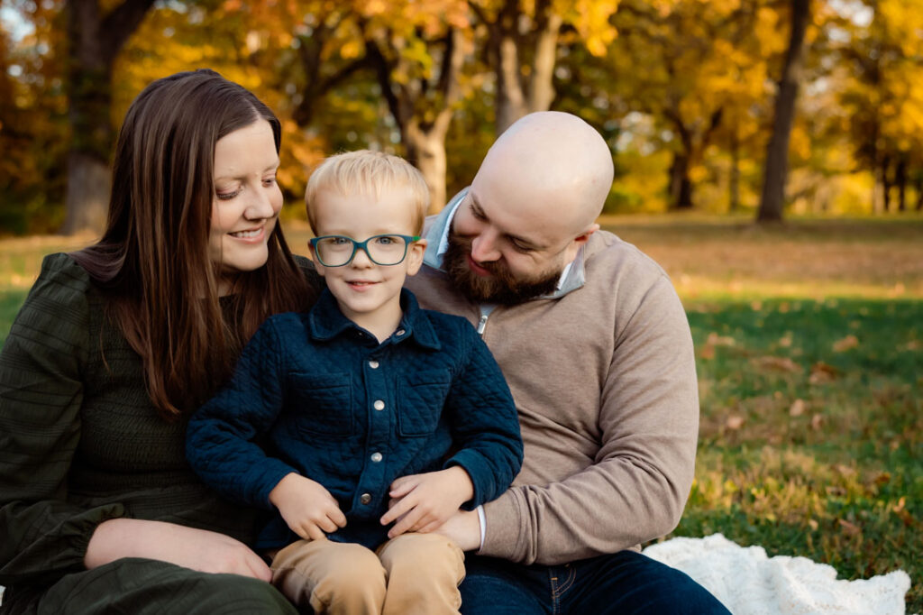
Can you wear red for fall family photos? It depends.
There are a couple of red shades that work at this time of year, and they’re both DEEP shades of magenta or brick.
In general though, reds are tricky in the fall. They’re TOO contrasty.
I don’t love a true fire-engine red during peak colors. But that color does work well just before peak color, when there’s still a lot of green and less yellow.
Outfit colors to avoid in the fall: Cool blues, purples, and pinks
Our eyes can see when the relationship between two colors isn’t harmonious. There’s a set of colors that, for the most part, aren’t going to mesh well with peak fall shades.
But know this: If you are dead-set one of these colors, then do it! These are suggestions based on color theory, and there are always exceptions that look good even when it doesn’t necessarily make sense.

Fall color to avoid: Saturated or cool blues
Let’s consider the blue in this handsome young man’s jacket. Can you tell why it’s not quite hitting the mark?
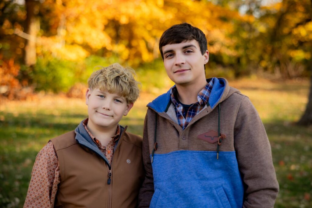
This blue is too cool and colorful—too saturated.
Here’s that same photo again, but I used some Photoshop magic to change the hue and saturation. See how the blue no longer POPS out distractingly?
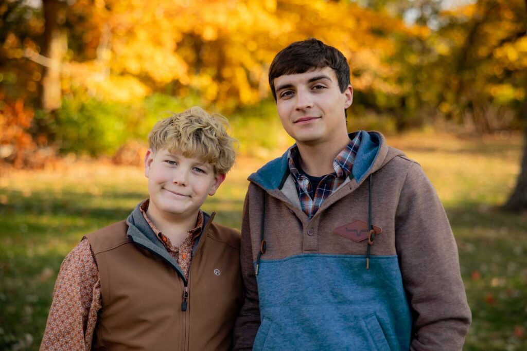
This means you’ll need to watch your denim colors, too. I don’t love light denim in fall.
Dark, rich and almost navy blue denim blends much better than light denim.
Fall colors to avoid: Purple and lilac
Purple in pretty much any shade is going to create issues.
This photo is a good example of several purple shades during peak fall color.
These outfit colors during another season would have worked beautifully! The yellows in the environment, however, were just too rich and warm for these cool purple/blue tones.
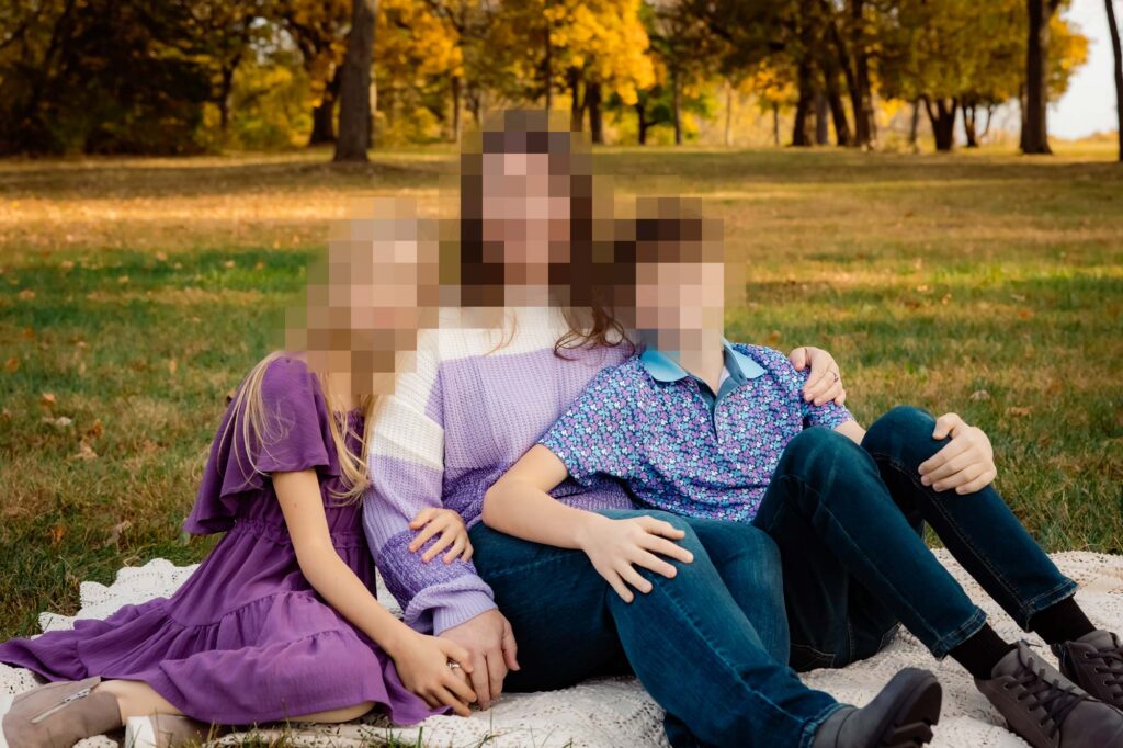
I’ve found this is the case all but ONE shade of purple on the color wheel: aubergine, aka eggplant purple. When it’s VERY dark, you can get away with it since it behaves like a jewel tone.
There’s a time and a place for purple, but peak fall colors wouldn’t be my first pick!
Pro tip to choose great fall outfit colors
Use the environment colors when planning outfits
Don’t lay out everyone’s outfits on your neutral-colored bedspread; find a gold or dark orange blanket, and use that as your backdrop!
Lay out the items on top of it. You’ll be able to see how the colors play off each other and the environment more clearly.
Wrap-up: Best colors for fall family photos
Great choices for fall photos
- Desaturated and muted oranges
- Warm greens (closer to yellow than blue)
- Mustard yellow (muted yellows closer to orange than green)
- Rusty dark reds, verging toward brown
- Any shade of brown
Avoid these colors in the fall
- Purple
- Lilac and lavender
- Cool blues
- Light blues
- Fire-engine red

0 Comments