

Yay! You’re getting extended family photos taken! It’s an accomplishment to get multiple generations in the same place at the same time. Convincing everyone to have photos taken is even harder.
But now everyone is asking: What should we wear for pictures?!
What to wear for extended family photos
The instinct is to get super specific, so there’s no ambiguity, but that’s how we ended up with the “white T-shirts with khakis” thing.

JUST SAY NO to matching outfits. Please, I beg you.
Here’s your to-do list:
- Share a color palette.
- Share the do’s and don’ts.
I’m going to walk you through both, and give you some visuals to boot. Yay, examples!
Step 1: Color palette
For extended family, you need to go BIG. Give folks a lot of colors to choose from, so they don’t feel limited.
Pro tip: Any two-color palette is not going to work, especially if those colors are black, white, or khaki. Trust me when I say that you will not like your photos if you dress this way.
Find a palette you like on Pinterest, or put one together on Canva (a user-friendly web-based design tool; I use it to create my palettes).
The positive of a big palette is that you still look cohesive, but not too matchy-matchy.
Extended family photo color scheme #1: Jewel tones


A lot of great colors in here to choose from—16 in all. A lot of neutrals, both light and dark. A few bold colors, but nothing too crazy.
Navy blue is a staple in my extended family palettes, because inevitably someone will have jeans on. Might as well embrace it!
When you hand over your palette, be sure to advise against overuse of any of the brightest or boldest colors. In general, those are the colors in the first and second columns.
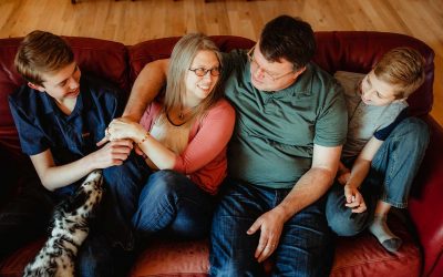
The family up above used this color scheme, and WOWZA, did they nail it or WHAT?
They even coordinated their individual family units uniquely, but because they were all working from the same color palette, the end result was *chef’s kiss* MAGNIFICENT.
Extended family photo color scheme #2: Yellow, gold, green, blue
We used this color scheme for my most recent extended family photo session (I’ll post a photo here as soon as I have them!). My brother-in-law will only wear light blue shirts, so I needed to work that in.
I added some blues, primarily warmer blues, to color scheme #1. This made my bro-in-law happy and still worked with the overall palette.
This might seem like a HUGE color palette, but the wide range of colors is how we’ll end up looking cohesive without being matchy.

Extended family photo color scheme #3: Neutrals with red, brown, and rust
This one overlaps with #1, but with fewer bold colors and more neutrals. The boldest shades here are the upper left and upper right: brick red and rust brown.

Twelve colors to choose from! Something for everyone, even “I-Only-Wear-Jeans-Uncle-Larry.”
Extended family photo color scheme #4: Bolder jewel tones
This one is bold, but it’s got a ton of variety. There’s something for everyone in here!
It includes the most jewel-ly of jewel tones: teals, wines, and golds, but also a healthy helping of neutrals, including a very light gray that almost reads as white.

Extended family color scheme #5: Blues, grays, and one accent
Another way to go, if you’re a little more color-averse, is to focus everyone on neutrals, but give one accent color. Like this:

Grays and blues are easy to find, and there’s a lot of possible variation.
Buyer beware: this can backfire if the accent color is hard to find. You could end up with several shades of the accent color. Which might work just fine… or it could be weird.
I prefer numbers one through three; I love me some bold color!
Step 2: Share the do’s and don’ts
When this many individuals are choosing outfits for photos, it’s impossible to control for everything (don’t even try; you’ll drive yourself crazy). The best way to keep things somewhat wrangled is to share the do’s and don’ts along with the color scheme. Let’s get to it.
DO’S
- Clothes you feel good in and can move around in, including comfy shoes.
- Vary textures and fabrics: think textured knits or chunky sweaters next to cottons and denim.
- Accessorize! A statement necklace, scarf, belt, suspenders, bow tie (I’m also a sucker for spunky socks). Hats on the ladies frame faces nicely, and newsboy hats on men can be really sharp.
- Super bold colors only as accents, or only on the smallest family members.
- Long skirts and dresses, both for comfort and movement.
DON’TS
- No clothing with logos or words on it. It’s super distracting.
- No glitter, sequins, or other extras that reflect light.
- No trucker hats on men (white foreheads are no big deal; I can fix that in editing).
- No thick stripes or small stripes/checkered print. Cameras do not like them.
- Don’t overdress (unless you know everyone else is doing it, too).
COLOR DON’TS
- No neon colors—including on socks and shoes.
- Pure white and solid black should be kept to a minimum (they read as flat in photos).
- Make sure any pure white/solid black fabrics are textured, not flat. Think waffle knit, ribbed… just search “textured women’s white top” and you’ll see what I mean.
- Creams or deep grays are great alternatives to black and white.
- Watch the gray on family members who sweat a lot. Sweat marks show like crazy on gray.
Want more?
Go check out my Family Picture Wardrobe Guide.
I’m no longer offering extended family sessions, but immediate family sessions are my jam, so let’s work together! If you need extended family photos, I’ll happily refer you to an Eastern Iowa photographer who can help you. Use my contact info to get in touch.

0 Comments